Visual Identity System // v1.0
The Stealth Aesthetic
18.3's visual language is built on a single premise: it should look like military-grade targeting software and high-end fashion colliding on a golf course. Clinical. Architectural. Honest.
The Design Philosophy
Most golf brands look like they were designed to sell optimism. Bright colors, sweeping fairway photography, aspirational copy about breaking 80. 18.3 takes the opposite position. Our aesthetic is derived from the tools that actually work under pressure — radar systems, architectural blueprints, military equipment.
The digital layer of the brand draws from the same world as the apps it houses: dark interfaces, glassmorphic surfaces, ambient glow. Cards that feel like they belong on a heads-up display. Buttons that pulse with intent. A UI that looks like it was built for a cockpit, not a country club.
The result is a brand that looks unlike anything else in golf. Dark. Technical. Confident. And underneath the clinical surface, quietly self-aware about the chaos of the game it serves.
Color System
Five colors. Each chosen for a specific functional and emotional purpose. The palette works as a system — every color has a defined role.
Deep Black
#111111
The foundation. Every page, every surface starts here. Deeper than jet black — it creates the void that makes the orange ignite.
Jet Black
#252525
Card surfaces and elevated layers. The stealth mid-tone that separates content from background without breaking the dark aesthetic.
Alabaster White
#FAFAFA
High-contrast primary text and main logos. Not pure white — slightly warm, slightly human. Clean and legible at every size.
Slate Gray
#6D8196
The technical voice. Used for specifications, secondary data, muted labels, and supporting copy. The quiet layer.
Neon Orange
#FF5C00
The Provisional Ball. Primary actions, warnings, the brand mark, and every accent that demands attention. The laser dot in the dark.
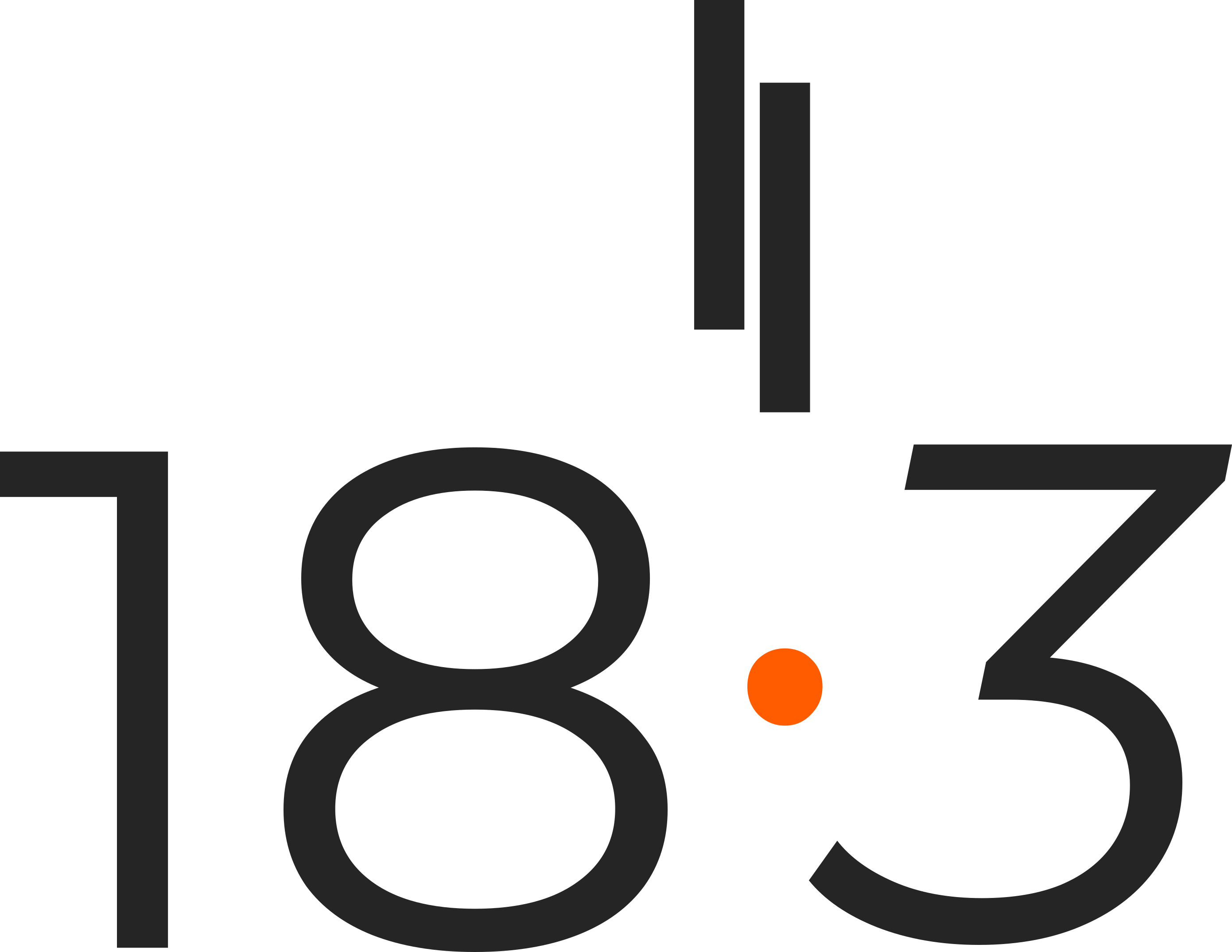
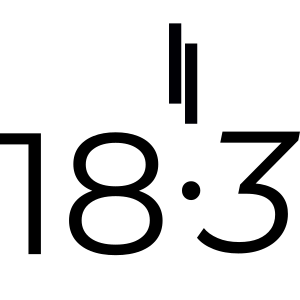
The Dot Protocol
The brand is 18.3. The decimal point is the provisional ball. In every digital environment, every physical embroidery, every printed label — the decimal point renders in Neon Orange. This is not a stylistic preference. It is a brand rule with no exceptions.
The dot is the entire story in a single character. It represents the moment between the bad shot and the second chance.
Typography
Two typefaces. Each with a defined role. They should never be used interchangeably.
Primary — Montserrat
ALWAYS IN PLAY
Used for all primary navigation, headings, body copy, and buttons. Weight 800 for display. Weight 300 for body.
Technical — JetBrains Mono
STATUS 404: BALL NOT FOUND
INITIATING RELOAD PROTOCOL
52.3676° N // 4.9041° E
Used exclusively for data, numbers, coordinates, technical labels, and the brand's self-deprecating microcopy.
UI Patterns
The digital brand uses a consistent set of surface and interaction patterns across every screen. These are not decorative choices — each one has a functional reason.
Glass Card
Frosted glass surface with subtle border. Used for all content cards, feature blocks, and info panels.
Pill Badge
System OnlineLive
Used for status indicators, eyebrow labels, and category tags. Always pill-shaped, always monospace.
Buttons
Primary →Outline
Pill-shaped. Primary carries an orange glow shadow. Outline uses backdrop blur. Both scale on hover.
Orange Tint Card
Used for featured sections, CTAs, and highlighted content. The orange gradient creates warmth without overwhelming the dark base.
Logo Usage

Primary — White on Dark
Inverted — Black on Light
All Black on Light
Design Principles
01
Depth Over Flatness
Glassmorphic surfaces, ambient orange glow, layered backgrounds. The UI has physical weight. It feels like something you could reach into, not a poster you're reading.
02
Clinical Humor
The brand's personality lives in the technical font, in the microcopy, in the empty states. Never in the navigation. Humor has a designated zone.
03
Restraint as Confidence
Five colors. Two fonts. One decimal point in orange. Rounded cards, not sharp grids. The discipline of the system is the statement. Adding more would say less.
04
Honest Materials
In apparel, we use fabrics that perform in the rough, not just on the fairway. In software, we show real data, not flattering summaries. The brand never lies about what it is.